 situational irony.
'Conventional'. lately this word has begun to sting as much as 'uncreative' and 'unoriginal', maybe even to the degree of 'cliche'. however, how does one overcome the conventions to which they are accustomed, and thus evolve?
situational irony.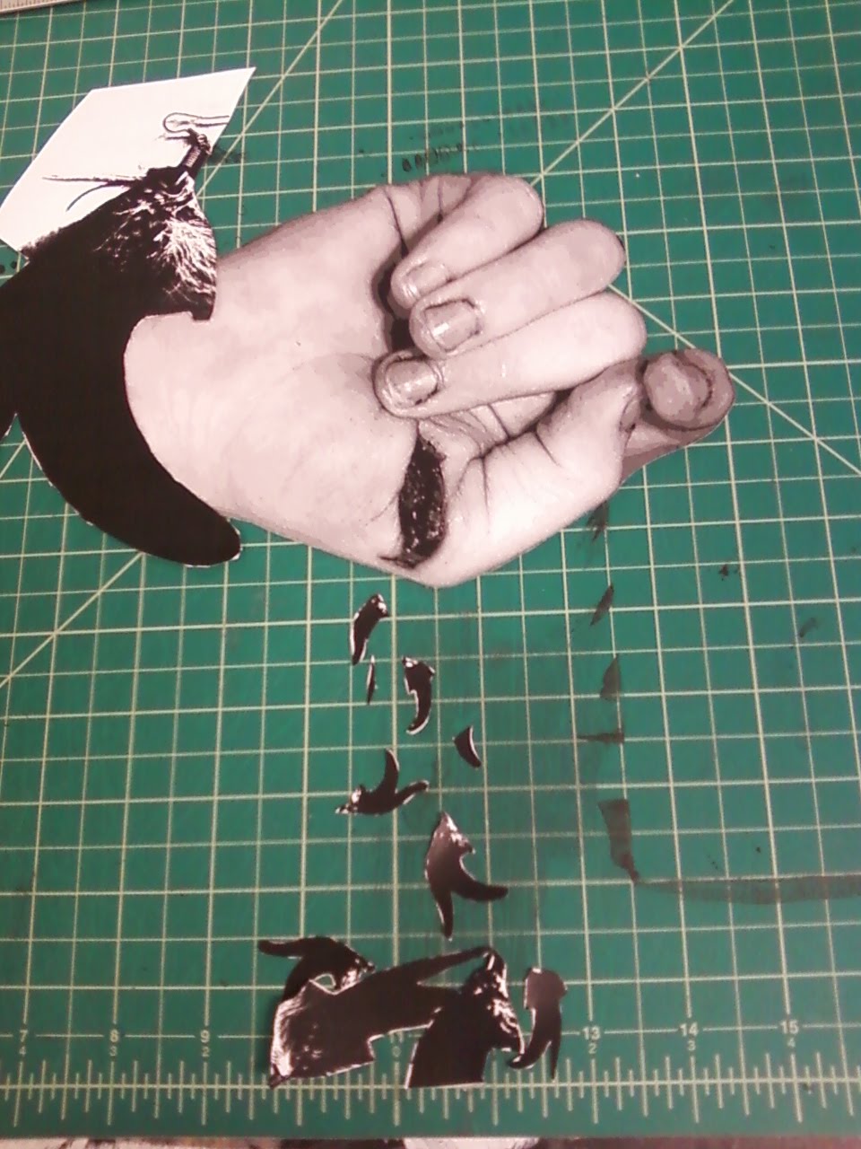 Project one for 2d, set up as it would be glued down on paper (relative to the borders on the cutting board, anyway)
 (photo courtesy Carnesaurus on Flickr)