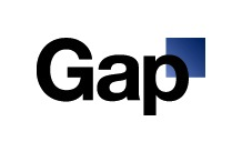
Prior to this watching parts of Helvetica (the movie) in class, I didn't have a problem with the font, and I still don't. But in the case of this logo (which affects me personally, because i have a part time job at a gap subsidiary) it looks like crap. The old logo felt very mature and respectable, actually reflecting the characteristics for which the clothing brand is appreciated, but this is just so neutral and pales in comparison.

if they had at least gone with a look more reminiscent of the first gap's storefront, it wouldn't be awful. at least that looks modern. Again, in comparison, the helvetica looks tired.
 (photo courtesy Carnesaurus on Flickr)
And why the tiny gradiated square? It looks shy and uncomfortable in that corner
No comments:
Post a Comment